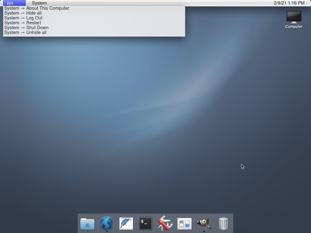
"Resemble" is a start like Elementary on Linux and other distros that mimic the "look" but never the feel. TH^Hhere is a lot of legacy PC keyboard stuff that is annoying.
Here is what is missing:
Global menu bar: A concept in user interface design where a system-wide widget on the screen displays the menu items (also known as “actions” in Qt) for all applications I've tried “actions” in Qt and is not at all the same feel.
A positional "sane" mapping of keys. I swap left ctrl and left alt in Linux. Alt on a PC keyboard is positioned where the Command Key would be. I install AutoKey to map all of the Alt keys to Ctrl keys in the Terminal: this is so my left Alt+c (Ctrl+c) will Copy (Command C) by sending ctrl+shift+c, and my left Ctrl+c (Alt+c) will send ctrl+c (break) to the Terminal.
As far as I can tell, textbox navigation keys, like Home and End "PC" behaviour, are hard-coded in X11. Command ( + Shift) + arrow keys navigation in a textbox does not work as I expect, and cannot be configurated, I would need to modify the X11 source code and build from scratch.
I'd just say "to each their own" normally, but you describe this as "legacy PC" stuff, so I feel compelled to respond. I vastly prefer non-Mac keyboard shortcuts, to the point where I will only use a Mac (even temporarily) if I can run Karabiner and pull in my configuration. I simply don't understand how anyone reliably and comfortably finds the command key blindly with their fingers. The whole point (as I see it) of putting the Ctrl key where it is is that you can instantly find it blindly because it's in the corner.
I'd also mention that there's no way (AFAIK) to have a two-key shortcut delete the previous word on macOS out of the box, whereas on basically every Windows and Linux desktop it's just Ctrl-Backspace.
Likewise with the global menu bar, I detest this way of handling menu widgets. I wouldn't use any DE (on Linux) that forced me into it. I don't want to have to move the cursor farther than necessary, and I don't like being locked into "one app at a time" as my global scope.
So I personally am very glad that there are projects that care about aesthetics on the Linux / Unix desktop without just copying the particular desktop metaphors and approach to user interfaces that Apple seems to cherish. I don't think there's a point in trying to "convert" Apple users by copying their desktops. If there are Mac owners who want to switch to a free operating system, while keeping the exact same desktop, they should start their own project to copy macOS.
>I simply don't understand how anyone reliably and comfortably finds the command key blindly with their fingers.
You do it with your Thumb, and once you do you can’t go back and then you do not understand how this dumb design of putting Ctrl in most uncomfortable position in the world was made.
When you type blindly, your fingers are on asdf-jkl; row and your thumb easily finds Cmd key near the spacebar. How on earth anyone can press Control in the corner without moving your hand from comfortable row for blind typing?
Just use the built-in readline bindings: option-delete should delete the last word you typed.
Personally, the PC keybindings are completely alien to me and make no sense and bring my productivity to a stand-still. Without my readline bindings text editing is a straight-up chore.
While we're on bindings, it's ridiculous to me that no OS has a key for system level bindings that is separate from the key for application level bindings. For the sake of example, I'll call them the Sys and App keys.
<Sys-{x,c,v}> to manipulate the clipboard.
<Sys-{up,left,right}> to maximize and split window on left or right.
<App-s> to save; <App-t> for new tab (in browsers), <App-f> to search.
I really dislike when apps interfere with what I consider to be system level shortcuts, like copy/paste. But I also recognize that for some places (e.g. text with formatting) it's nice to allow it. So here's the nice thing: by default <App-{x,c,v}> can be the same as Sys, but this is a shortcut apps can override. Tada! Best of both worlds.
It seems like between Ctrl, Alt, and Cmd/Win, we ought to be able to separate these cleanly, even with some legacy compatibility restrictions. It frustrates me that Apple went partway there with the command key, but then decided to blur the lines, and there's no longer a clear distinction (actually, as a non Apple user: what do you even use the control key for?).
Windows is kinda sorta trying to do this with the Win key. It's not as consistent as what you describe - and it can't really be without breaking a lot of backwards compatibility for the users - but there's a slew of stuff like Win+M to minimize all windows, or Win+E to open Explorer.
This is exciting - I hope it gets momentum. I used to use BSD on my laptop and although it was a bit less convenient than Linux in terms of hardware support, etc. I really loved the philosophy. Some of the desktop-oriented distributions died out and have been replaced by others, so it's not an ecosystem I feel comfortable really investing my time in.
But my wife loves the look and feel of Mac OS, and has just grown frustrated with a few things lately that are obviously just restricting users to squeeze them to more expensive products or locking them in to Apple's ecosystem. She's rarely cared much about my FOSS hobby before but something like this would actually appeal to her, I think.
What I love about FreeBSD is the documentation. I was able to skim through it and get a good understanding of how everything fits together, and how I can change it.
I'd love it if this project gains some momentum, it would be great to have an alternative to Ubuntu/Elementary OS.
In particular it would be nice to have an alternative for macOS users. Jumping to Linux from other OSes can be tough at first.
> restricting users to squeeze them to more expensive products or locking them in to Apple's ecosystem.
Yeah also this. I can't use my old MacBook 2005 anymore because the software I need to use won't run on older versions of MacOS, and I just can't install newer versions of MacOS without some kind of hack, which leaves the computer half-usable :(
Yes! FreeBSD has great documentation. One of the great things about the kernel+userspace unity. When I worked on HBase they literally used the FreeBSD style sheet for their docs, and it was similarly good documentation.
If there was a way to have the Pantheon desktop experience of elementaryOS on BSD or Illumos without having to build it myself, I’d be there in a heartbeat.
>But my wife loves the look and feel of Mac OS, and has just grown frustrated with a few things lately that are obviously just restricting users to squeeze them to more expensive products or locking them in to Apple's ecosystem.
So glad this is catching on. Although I was surprised this coming from Mac and not iPhone. What is it with Mac that caused the frustration?
On iPhone, it is clear everything is about pushing for services revenue.
I haven't looked into it too deeply, but she has one of the less expensive netbook-type models and it appears to raise errors quite frequently because she should buy more iCloud space even though she has space on the local disk.
She's also found it increasingly hard to find config settings the last few years.
Just curious, what do you feel is squeezing you to a more expensive product lately?
I still use a 2012 Mac mini from time to time. It recently stopped getting the latest OS upgrades, but getting 8ish years out of a product before being gently pushed to upgrade doesn't strike me as all that unreasonable or money-grabbing.
Plus, both Corellium and Asahi Linux are porting Linux to the M1 MacBooks. I have Ubuntu installed in a separate partition and boot into it occasionally. The main issues right now are audio and graphics support.
Okay it isn’t cheap to buy, however TCO for a machine th at will probably you serve well for 8 years for around €1000 sounds good to me. It is also their cheapest laptop which is why I used the word cheap.
I might agree that "cheap" is the wrong word, but "value" is definitely the right one. There's nothing at its price point that provides a similar value prop.
It's worth being clear and noting that, somewhat unlike Hello, which is largely an attempt at looking like MacOS, with some attention given to the UI and things like keyboard shortcuts to make it sort of feel like MacOS, NEXTSPACE comes much closer to mimicking the functionality of NeXTSTEP and, by extension, MacOS (X).
I do wish GNUstep and some of the other projects around it had more life and applications written for them. It could be a lovely OS with some work. And I do mean OS -- if one built a distro fully around GNUstep, it'd provide all the interfaces, both programmatic and GUI-wise. And it could be lovely.
Not sure there's enough motivation left to get that ball rolling, though...
When Steve Jobs created the first mac, he tried to replicate the look and feel of the Xerox Alto. He did not pay much attention to other aspects such as Smalltalk-80 and object oriented programming.
NeXT is an attempt to incorporate those concepts that were initially left out from the mac, thus creating an experience that is more faithful to the original Xerox Alto. That's the origin of Objective-C.
It may be possible to create something like macOS based off GNUstep. There is a project going on that direction... Etoile. http://etoileos.com/etoile/
There's actually quite a difference between Classic Mac and Alto/Smalltalk. (Both sides would argue that the other one totally missed it. There's even some evidence hinting at the Lisa having experimental windows even before the PARC visit, and these screenshots look actually more like the final product than what came after the visit. [1]) Just install an Alto emulator and try it yourself. Also, the Mac System was famously programmed in Object Pascal (like the Lisa).
I really like the idea of Étoilé, but a lot of the docs are outdated because of the death of Gna!, and right now the focus is more on the CoreObject framework rather than the UI.
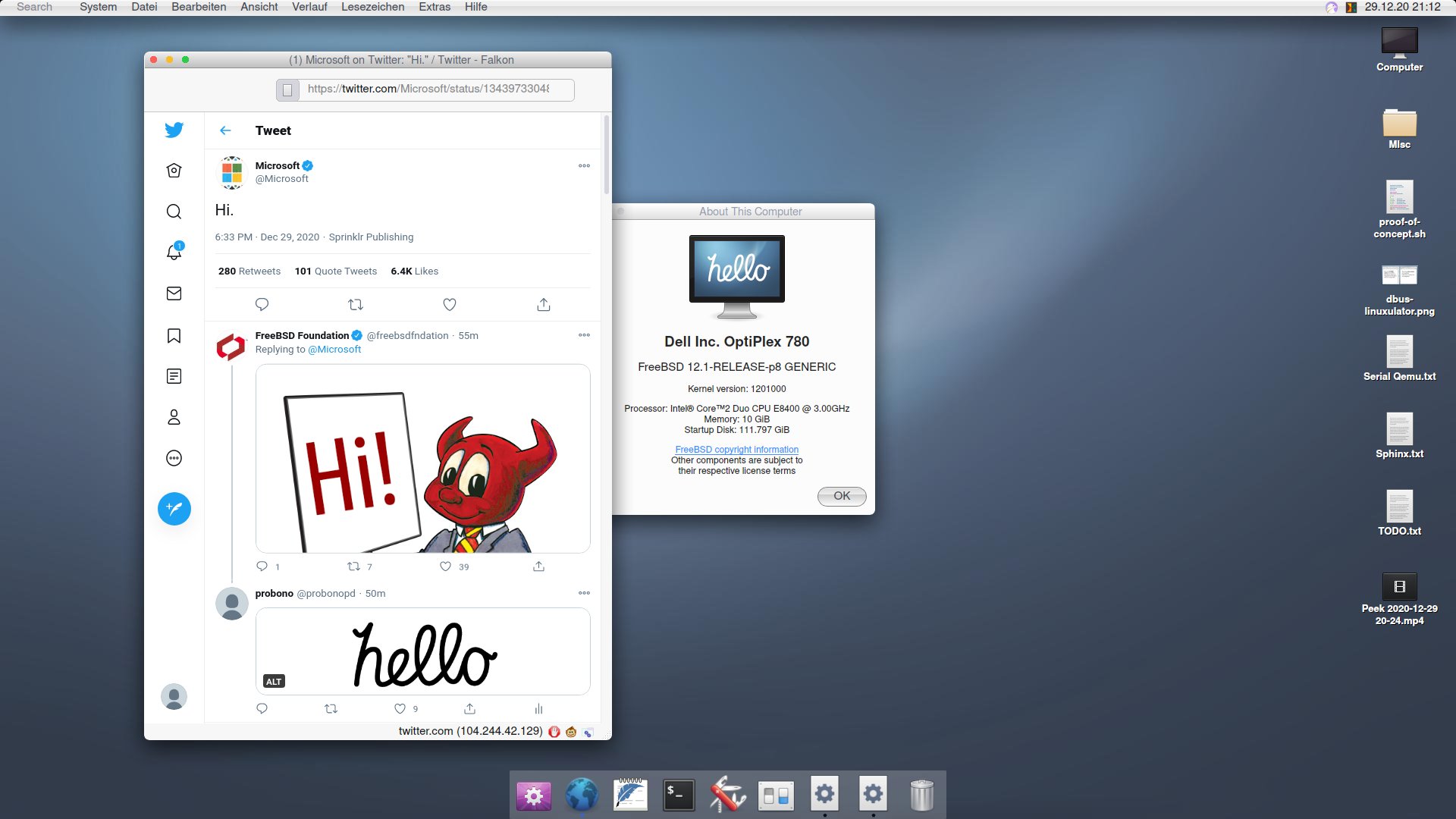
It was the only screenshot I could find, it is a bit minimal, and it requires scrolling down the page (which seems like a lazy complaint, but c'mon, the graphics are the whole point of this project, put it front-and-center!)
Your shame is rejected, they are the ones who messed up.
> Isn't this a massive copyright infringement on Apple's design?
I'm not a lawyer but I think Xerox had the same question back in '89 [1]. Given Apple's luck in pursuing infringement claims against Microsoft [2], I doubt a copyright suit would be fruitful in this case.
I am using ctl-c ctl-v ctl-x and ctl-z "undo" right now, in 2021. These keyboard shortcuts and their menu-driven actions were definitely claimed as protected interface by Apple long ago. Apple's claims to user-interface control are wearing thin after close to four decades, no?
The look of the text in the top left in this screenshot where they are trying to mimic an “about this mac” sort of deal, frankly leaves a lot to be desired. It just looks very unattractive to me.
I mean this in the nicest way, but are you seriously suggesting Apple is looking to the open-source Linux community for UI design ideas? Isn't it much more likely the trend is just industry-wide, and Apple is part of it as much as Gnome is? Apple's own UI has been moving in that direction for years anyway before Big Sur.
General trends? Yes, of course. But at Jobs's very last WWDC event, they demoed a lot of new Mac developments for Lion that specifically (not generally) mirrored some of the features going into Gnome Shell after (very public) design iteration. At the time, I came away saying that it was basically "Gnome Shell, rotated 90 degrees".
Not sure what "open-source Linux community" means to you, besides a phrase that can be used to denigrate and diminish the work of people who have skill and vision by associating them with unrelated projects that lack polish.
You're also doing a pretty annoying thing where, rather than engaging with someone on the topic of discussion, you instead appeal to the audience's intuition and essentially suggest that the conversation need not happen because the other side can be dismissed outright due to Common Sense things that everyone Knows. (It's a great tactic when your goal is to prevent anyone from taking something seriously because serious examination would necessarily lead to confronting something uncomfortable.)
So, Gnome's design and Apple's didn't exist in a vacuum. I'm not saying Apple told someone to go rip off Gnome 3, or that Gnome 3 is just better than Big Sur in some way. But I think it's altogether too harsh to deny it had any influence when we look at the changes from Catalina to Big Sur.
To me, Big Sur's design is very clearly taking its aesthetics -- for better or worse (maybe better and worse) -- from iOS: minimizing "chrome" as much as possible to the point of making title bars vanish when it's deemed feasible, reducing buttons to flat single-color icons, and so on. Your screenshots of GNOME 3 look more like Catalina than Big Sur to me, honestly; the buttons still look like, well, buttons; the title/toolbar goes all the way across (unlike Big Sur but like Catalina), the buttons are grouped (unlike Big Sur but like Catalina), etc.
I don't think anyone would say design exists in a vacuum, nor that the open source community has no ideas that Apple or other companies would consider -- I mean, look at CUPS and KHTML! But open source has, well, not historically been great with its desktop UX design. The best free software interfaces that I see tend to take pretty direct cues from (hopefully well-designed!) commercial counterparts; more often than not deviations from those established norms make things worse rather than better.
I've been looking at the screenshots you've posted and I'm struggling to see what influence you're seeing in Big Sur that came from Gnome 3.
The best I've come up with is the switch from a two row title bar/header to a one that is integrated into just one row. Which could very well be inspired by Gnome 3 or parallel evolution.
Are there other UI elements that I should be seeing in Big Sur that look like they have inspiration, homage, blatant copying that I'm not seeing here?
To my eye they have a somewhat similar aesthetic but and general layout but their differences are many when looking closer.
This is true. Macos's window management is still a dumpster fire (Cmd-tab to go to the last window raises all windows in that application. And switching to the previous application across two monitors will focus on the application windows in the monitor of the most recently focused window - not the last window).
That's because Cmd-tab switches applications, not windows. Generally macOS doesn't do "window management" it does "application management". Once you start thinking "what application is active" instead of "which window is active" you'll find it pretty natural. Took me about a week of full-time use of decades of Windows/Linux. (Although, admittedly I had used MultiFinder back in the day, so I was already used to the paradigm.)
Calling it a "dumpster fire" is a bit overdoing it when it's just a different paradigm.
I think everyone is aware that it's a different paradigm. It was introduced in the 80s as a way to have floating windows for the application and reuse the same tool windows for e.g. Photoshop without a parent window. But now even Photoshop has a parenting window. Almost everyone just maximises all their applications since Mac window management doesn't work. And everyone else has to install Spectacle or Rectangle[1]
I am attacking the paradigm. It has had its time. It is done. It should leave.
What's the alternative? If cmd-tab switched windows, my own workflow would be a nightmare. The list of all windows when switching would be unmanageably large and I'd have to manually raise several windows after switching.
My preference would be to keep it as is but have window switching work like app switching. The separate order in which the two cycle is a pain.
Elementary looks like a great attempt at a clean desktop. Lots of attention to detail (although odd that they have a gif searching applications on the front page with such a mis-centered text insertion mark!).
I really wish that Gnome would go all-in on the single menu bar approach of OSX. I know it's gone back and forth over the years and broken from time-to-time but it really is a much better way to do things versus the windows menu-per-window approach. IMO obviously, but I've used OSX for a decade and Windows/DOS for 20 years before that and top menus have always just been a better experience.
The menu bar is one of the most frustrating parts of macOS for me. It kills Fitts' law when navigating browser tabs, which is what I'm trying to do up there 90% of the time.
I think the trade off - benefitting from Fitts law when you need to use a menu AND saving screen estate - is worth it. At least switching tabs is a trivial keyboard shortcut.
Elementary only mimics the appearance, it's still Linux (and all its bloat and unfriendliness underneath). Hello looks like it's trying to make it usable as the Mac too.
AUIU, as someone who's very peripherally connected to both.
(I'm an active-ish member of the GNUstep list & in my spare time I've been working on a remix of openSUSE with GNUstep on top; I exchange messages with ProBono about UI design, history, keyboard layouts etc.)
The initial version of the HelloSystem was based on GNUstep on FuryBSD. However, apparently -- I did not see any of the comms -- he found the GNUstep people very hard to work with and fairly quickly ditched it and started to roll his own.
I must say that I've found the GNUstep folks to be rather intransigent myself. I've found it hard to get answers to simple questions, and when I make small suggestions, they've been mostly been shouted down or ignored.
ISTM that the GNUstep project see themselves as building a set of libraries, classes, and tools for building apps. As it happens, as a side-effect of that, they've built a desktop environment as well, but they are not interested in that and don't care about it. Desktops are not their business. They're perfectly happy if others want to use GNUstep to build desktops, though.
For reasons that escape me, the GNUstep team are not bothered about ensuring that there are current packages in mainstream Linux distros. This seems to be seen as something for others to do.
Etoile violated one of the core rules of FOSS, ISTM: "release early, release often." They never actually put out a release at all in some 15 years of work. You want code? Here's the source: download it and build it yourself. It's a tragic oversight.
I'm not against the choice, and I can imagine some valid reasons to choose it, but in the helloSystem docs I read so far I only found some common criticisms of desktop Linux UI (bloated, unfriendly, disorganized etc). Whether true or not, I really don't see how the kernel choice impacts the graphical experience they are imitating. This seems more of a criticism of distros, poorly followed or non-existent HIG for DEs, or even just the general ad-hoc nature of FOSS projects. That's why I don't see how basing a new free software project on FreeBSD would solve any of that -- it seems completely orthogonal.
Also, I get a lot of their criticisms of existing DEs, but it seems they are tossing a lot of work out without a viable replacement with buy-in, e.g. "XDG specifications are considered overly complex but insufficient and should be avoided, but may be acceptable as legacy technology for compatibility reasons". There's plenty of valid criticism of XDG, but until there is any support behind helloSystem, it reminds me a bit of this classic xkcd: https://xkcd.com/927/
All in all I'm actually excited about the project, since regardless of the kernel, I'm sure the DE they are developing will get ports elsewhere (e.g. to mature desktop Linuxes and BSDs), and any effort that helps macOS users jump to FOSS-world is also super appreciated!
because macOS is BSD based not Linux Based seems a damn good reason to make one that's going to feel similar to macOS, especially to the type of geeks who would switch to a *nix clone.
You'll have the same command line libraries built in instead of the GNU ones. Now, I'm not saying i _want_ the BSD tools instead of the GNU ones, but it makes a LOT of sense if you're trying to keep the same behavior.
See, preferring BSD userland would be a rationale I would at least understand, but I didn't find that motivation in the documentation -- at least what I read of it. Instead I just saw a lot of criticisms of user experience and development experience of unrelated graphical (userland) software that are common to all the free desktop OS's.
“ A lightweight, standard publish/subscribe mechanism should be identified; possibly something like MQTT (which would have the added benefit of allowing for network-wide communication). In the meantime, the use of D-Bus as a legacy technology may be acceptable (even though it is considered obscure, convoluted, and closely linked with various other Red Hat technologies.”
This sort of sums it up right there. I mean I think dbus is a trash fire, but not because it is tied to RedHat, and “something something” hand wavy MQTT isn’t a real solution.
This seems to be more of a project driven by Linux hate then actual design principals. The former is not so much a problem as the latter
It may be appealing enough for a user to try it, but I foresee disappointment. Mac OS is not only about the UI but also about all the software for it. How easy it is to install and use it out of the box. Drivers are never an issue. It is very unlikely that the average user will have to run commands in bash or edit some config files in a text editor.
It would be cool if some Linux variant could resemble Mac in this way.
If you talk about system drivers it's not really fair. Having control of all system components makes driver support a joke compared to handling the constant avalanche for PCs. Try installing a hackintosh and you have a good chance of immediately running into Linuxesque driver issues.
If you talk about peripherals I've had plenty of issues on macOS.
No. The Pop! OS UI is basically gnome with tiling. I wouldn't say it draws from either Windows or Mac OS, though I think Gnome takes cues from Mac OS.
I wanted to like the tiling, but I always seemed to get lost after a few hours if I was task switching too much, so I just switched back to KDE, which is definitely more Windows-like.
For me the draw to System76 is the hardware, knowing the right drivers are already integrated, etc. and their focus on CUDA / TensorFlow tooling. The first 2 are common reasons to like Apple and their philosophy...
edit: Oh - like another commenter I misunderstood and thought you were discussing resembling the UI. But no you're talking about integrated hardware and software and I guess that's the point I ended up agreeing with :)
No, have you used it? The Gnome customizations that go into Pop_OS! are more noticeably influenced by Windows-isms than they resemble Mac-like design (unfortunately -- the Windows influence leads to poorer outcomes that only really make sense when you realize that it's because it matches something in Windows, and not because there's any good from-first-principles rationale for those things).
It’s my daily driver. I’ve used Windows and OSX heavily for the past 30 years. Pop is not really like either. It’s its own beast, and I rather like it.
Sounds cool, although it still seems very early. Will keyboard shortcuts be primarily using Control or Super? As strange as it sounds, Control-driven keyboard shortcuts are one of the main things I think about every time I consider switching (and this is almost entirely because of the conflict of Control-C in the terminal).
> Will keyboard shortcuts be primarily using Control or Super?
On linux, Super as the shortcut for window operation is gaining ground, leaving Control and Alt for the other shortcuts.
Control is idea for the text shortcuts (emacs: Ctrl-A for beginning, E for end etc), and Alt for the menus (ex: Alt-F for files) even if there are a lot of crossovers (ex: Ctrl-F for find)
> this is almost entirely because of the conflict of Control-C in the terminal
I would suggest you remap intr to ^X : stty intr ^X : the X and C keys are very close, so it becomes natural very quickly
I've seen quite a few people doing it, it inspired me to do the same: it very quickly becomes natural, far more that Shift-Ctrl-C
In the Mac, terminal apps use Control-C without any problems. Only native Mac apps use the Command (Apple) key, so I see no conflict between these two key combinations.
Command-C is copy basically everywhere in macOS. Even in electron apps and qt apps. I haven’t come across an app in about 10 years which used Ctrl-c for copy.
I really appreciate seeing someone creating their own interface instead of re-skinning the popular shells. If the devs out there working on this see this thread, great work!
The cursive animation of 'hello' has the o written wrong. You're supposed to do a clockwise stop at 12 o'clock when drawing the 'o' and do a counter-clockwise back to 12 to meet. Apple would never mess that up especially when Steve Jobs was critical about typography on the early Macs.
I tried to install Hello, and set up a live USB. The GUI was nice enough to satisfy me.
The problems started when I tried to install it. The installer assumes that I want to erase the entire drive.
How can an alternative OS expect to be given first-class ownership of the internal drive? It's so... prideful. Many Linux users dual-boot, as do some macOS users on x86.
After trying FreeBSD and NomadBSD, in the end I got GhostBSD working. The trackpad works, but sensitivity is way off.
It was a fun experiment, and I like the attempts at making a prettier GUI, but this won't be my daily driver.
Linux/BSD desktop UI is not the thing holding me back from switching from macOS! There are two things:
- All the keybindings are wrong.
- The mouse sensitivity is terrible.
Maybe this is a hot take but I actually think most Linux/BSD UIs are fine! Pop!_OS looks great, is easy to get working, doesn't involve me tweaking random config files, hardly every breaks from an update, works with my graphics card, etc.
Instead:
- Linux/BSD UIs use the Control and Shift modifiers most heavily, instead of Command and Option. I should be able to use one keybinding everywhere to copy, without having to switch to Ctrl-Shift-C to copy in a terminal, where Ctrl-C is an interrupt. macOS lets me hijack any menu item globally on the operating system to assign a custom keybinding.
- It is more or less impossible to make the mouse sensitivity feel like macOS (it's either way too slow or way to fast, and it seems as though the settings don't exist to change recreate the macOS acceleration curves).
By "the keybindings are wrong", you mean that the keybindings aren't what you want / what you're used to. Plenty of people prefer the keybindings this way.
> It is more or less impossible to make the mouse sensitivity feel like macOS (it's either way too slow or way to fast
Replying because of this - are you using libinput instead of the synaptics driver? Libinput is really a very big downgrade, and hardly has any configurability. I would be very surprised if you were unable to tweak Synaptics to meet your needs. I find my touchpad far smoother and easier to work with than any Apple touchpad I've ever tried.
For reference, here are the settings for pointer motion alone that are exposed with the Synaptics driver in KDE. https://i.imgur.com/W0dDs2j.png
> By "the keybindings are wrong", you mean that the keybindings aren't what you want / what you're used to. Plenty of people prefer the keybindings this way.
Sorry for the confusion. I meant this by way of the goal of “designed to resemble macOS.”
Totally get that people used to Ctrl shortcuts prefer Ctrl shortcuts.
Instead I meant that for systems like this OS, or Elementary, or any other OS claiming “it’s like macOS, but Linux/BSD,” people are missing the point and it’s not the skin that needs changing, it’s the keyboard shortcuts, mouse sensitivity, and other things that fall short of approximating macOS. (The feel not the look, you might say.)
Totally endorse this, thanks for the clarification. If there are people who want to replicate macOS on a Linux foundation, I wish them the best in that endeavor, and agree that they need to start at a much deeper level than just aping Apple's aesthetics.
Who actually wants two separate (app-specific!) key bindings for “copy”, which is meant to be a system-wide action? Thats terribly silly and immediately leads to you accidentally killing programs in your terminal. A very silly design choice IMO.
> Linux/BSD UIs use the Control and Shift modifiers most heavily, instead of Command and Option.
I don't think I would have a severe objection to reversing terminal shortcuts (i.e. use Ctrl-c to copy, Ctrl-Shift-c to kill). But really, these are dev tools and I don't think the alternative shortcuts are that hard to get used to. On Linux it just becomes second nature that in the terminal the normal shortcuts are all prefixed with 'Shift', because there are a bunch of more useful shortcuts directly under the normal keys.
Edit: incidentally you can change this on Linux. It's configurable. I suppose not many people seem to want to, which is maybe its own response to your question. See this thread for example: https://www.linuxquestions.org/questions/linux-software-2/ch...
I dont think the OP’s original point was primarily that the defaults are terrible, in any case. Its that the management of keybindings is godawful. The configuration fix you linked makes this point precisely. In order to have consistency in a basic systemwide function like “copy” you have to dig through forums or bust out your terminal emulator’s man page.
The OP said "All the keybindings are wrong", so I responded with the assumption that they intended to complain about the keybindings (e.g. the use of Ctrl instead of Cmd). If we assume otherwise, all bets are off.
In any case, I think you're assuming too much about how intuitive the system you've grown accustomed to is to other people. I accidentally kill programs in the terminal when I use macOS, because I can't keep the Cmd and Ctrl shortcuts separate in my head. Is that Apple's fault, or is it just something I'm not used to?
IMO, desktop UI designers would like to have three things. The issue is that they're mutually incompatible.
1. Continuity with the ancient tradition of having Ctrl-c send a cancel/abort (or SIGINT) signal.
2. Having the common operation of copying some text mapped to [modifier]-c.
3. Having the most common modifier key be the key in the bottom left corner of the keyboard, which is Ctrl on most PC keyboards.
You can't have all three at once in the same application. macOS solves this problem by abandoning 3, and using Cmd-c to copy text. Most Linux / Unix distributions solve this by partially abandoning 2, by prefixing the shortcut with an additional modifier in terminal applications so that the normal shortcut can continue to be used elsewhere. In my opinion they're both valid approaches. Personally I detest having to grope to find the Cmd key and remap my modifiers using Karabiner on macOS.
> Would you expect your OS to have application-specific shortcuts for systemwide, cross-application functions like copy and paste?
Maybe? The point in the comment I left you is that some kind of expectation has to be violated here. I don't find the Linux choice (to remap a system-wide shortcut for a single developer-centric application) to be too intrusive. But YMMV.
Mac keyboards put fn in the bottom left. Personally (disclaimer: Mac user) the third point is the least important, and if this is a problem for you, you should remap the physical command and control keys, which is fairly trivial to do on macOS.
Heh, you're not going to like this, but I do remap the keys, just not that way. I have fn -> Cmd, Ctrl -> fn, Alt -> Ctrl, Cmd -> Alt. This requires Karabiner, AFAIK.
This sort of imitates what I consider a sane setup in most applications. That is, "copy" is bottom-left button plus c, just like it is in every other operating system.
For me, #3 is actually very important. As I mentioned above, I have a lot of trouble blindly finding the (physical) Cmd key on the MacBook keyboard. Whereas the fn key is trivial to find, it's just the bottom left.
Thanks for the suggestion. I’ve done a few quick searches and it looks like everyone is talking about Synaptics in the context of touchpads? I’m on a desktop with a wired mouse. Should I look further into how to get Synaptics working for this? Or is that not going to work?
Yes, sorry. I incorrectly assumed you were using a touchpad, since usually that's what people are complaining about when they talk about acceleration. What desktop environment are you using, the one from Pop? I believe that uses Gnome, which is pretty well-known for having fewer configuration options. But maybe you can look up Gnome Tweaks (i.e. the Gnome Tweak Tool) and see if that provides some additional options? (A quick search suggests that it might only have "flat" and "adaptive" profiles.
KDE has mouse settings right in its System Settings application, of course. You can adjust acceleration in a very fine-grained way, to whatever fractional values you'd like.
On Linux, if you really want to dial it in and there aren't any GUIs that will do it to your satisfaction, there's always the ability to manually adjust stuff on the command line, see e.g. https://askubuntu.com/questions/205676/how-to-change-mouse-s...
To be clear, I appreciate that certain specific hardware isn't as well supported as it should be (it depends on the OS), and that's a perfectly legitimate reason to stick with one OS over another. I just thought this might have a quick fix if you were on a touchpad.
I've tried and failed to make this work. Its keybinding maps only apply to parts of the KDE she'll itself and the applications distributed along side a given release of KDE that all share the same keybinding remapping infrastructure.
Chrome's keybindings don't change. Firefox's don't change. LibreOffice's don't change. Slack's don't change, etc. etc. The end result is a nightmare of even more mishmashed mixes of keybindings depending on whatever window you happen to be in.
I've just given up.
The only thing I've found to work at all well is to just swap the position of Ctrl and Super, then go through all the KDE shortcuts for stuff like "Take Screenshot", and make them be similar to a Mac, but like "Ctrl + Shift + 3" instead. Then just deal with the annoyance of how weird it is to use my terminal. It's better than the annoyance of every single other thing being a mess.
If I could figure out how to remap all the control signals in my terminal to be like Super+c instead of Ctrl+c, then I'd be in good shape.
Ah okay. I care mostly about Window Management shortcuts, and that Alt + opens the drop-down menus. I find most other shortcuts I use are application specific or what I thought were global conventions. KDE does have a section called "standard shortcuts" where you can set shortcuts to open up "About" dialogs and several dozen other common actions - but for all I know it's then up to applications to plug into that? I suppose not a lot of developers targeting KDE for the experience...
Mac keyboard shortcuts are not well thought out. It’s illogical.
The Command key is used for shortcuts for the current active application, as well as controlling the operating system functions itself.
There is no keyboard shortcut to activate the system menu bar on top. Insane. You have to use a mouse to click on the menu. Or you might be able to configure some weird shortcut to do it.
Instead, I think Microsoft won this one. Windows uses Control to activate the active window’s shortcuts. Control-S to save it. Control-O to open a file. Etc.
Alt key is used to control the active window itself. Alt-Space is used to open the active window’s menu, to move it around, resize, and close. Alt-F4 is used to close the window. But I think Alt-Escape would’ve been a better choice.
Then the Windows key is used to control operating system level functions. Win-R to activate the run command. Win key itself will pull up the operating system’s menu.
I think Win-Space should be used as a global run command bar.
If this project goes anywhere, then please follow the Windows model for keyboard shortcuts.
Also, use Control-Space to activate the active application’s command bar, so you can type in some manual commands to the application. Like Vim Or AutoCad does.
If someone wants to mimic the Mac, I'd suggest they start by making it easy to port apps from macOS. Worst case scenario, you run binaries from macOS directly on your OS.
If the goal is looking and acting like a mac, implementing the entire set of application-facing OS interfaces is far more expensive than just theming and UX work.
That said, this has been attempted and supposedly works for simple apps (mostly excluding GUI apps) - https://www.darlinghq.org/
Theming can't go far without the plumbing that underpin Mac applications. You can mimic the look perfectly and it'll still feel odd. You can't run xterm and expect Mac users to think it's how it's supposed to be. You won't get far unless you also emulate the behavior with mixed high-dpi and normal screens and making apps look the same across screen borders.
This is a big undertaking. Microsoft was able to do this for UWP and iOS[1], but they're a billion dollar company with the man power to accomplish something like that.
The problem with all these Linux/BSD attempts at mimicking the Mac is that due to the nature of the open source components, they are mostly able to mimic the "look" but never the feel.
The one thing that makes OSX different even from Windows is the way it "feels" when you are using it. And the simple things you can achieve in a very simple and intuitive matter.
I just stumbled upon an example some days ago, when I needed to add a screenshot image to a PDF. It was surprisingly easy in the Mac: Double click the PDF to open it in preview, double click the image to open it in preview and then drag the file icon of the image into the pages view of the PDF. And the image is inserted as a page in the PDF without any issues.
To do that on Windows or Linux (I use Mint in my PC) I think I'll have to print the Image as a PDF and then use some other software to "stitch" the two files together.
And like that there are a lot of other UX small things that make for a more pleasant experience in the Mac, particularly for end users.
My favourite small detail on the Mac, is how the clipboard interacts with the filesystem. You can select some text, drag it into the Desktop and it will become a .Clipping. Now, if you drag and drop that clipping into a text field (e.g. textedit), it will be as if it was pasted.
This is certainly true for data types that the system knows how to serialize and deserialize, but (at least back when clippings were introduced) for others, the app that owns the clipboard data must provide the hook for the serialization and deserialization. Back in my first programming job, we were about to ship a shrink-wrapped software product that I will not name but you’ve almost certainly used, and we discovered that we “needed” to support clippings or else (I can’t remember if this was some Apple compatibility rule or some marketing person’s rule). We didn’t have much time, and we also didn’t have serialization code for this very complicated data structure that was on the clipboard, and my manager told me to just implement it by sticking THE POINTER in the clipping. I objected and was overruled. I did it, it shipped that way, and I will always be ashamed. You could only use a clipping in the same process that created it. I had to add code on the deserialize that checked to see if the pointer was valid. It still makes me sick to think about.
There is nothing practical about writing a pointer value to a file. This was a quick hack that made the feature appear to work rather than actually work. It's really bad engineering.
I agree with you, before the external constraints enter the picture. But as you said, it had to be delivered with this feature on a shorter timeline than a better solution allowed for. The choice between delivering something and delivering nothing, how do you proceed there?
This is also why Mac apps built using frameworks other than Cocoa (or Carbon) never feel quite right!
Sure, you may have recreated the copy and paste menu so it looks and feels identical. But did you remember to handle .clipping files? What about File > New From Clipboard? What about the system-wide custom keyboard shortcuts? Oh, and don't forget to make it all behave properly with Voiceover!
Advocates of Electron sometimes claim that it unifies the look of the application across platforms. This should not be a goal. Most people are far more like to use several applications on one platform than use one application on several platforms. It is the platform that the apps should be conforming to, not themselves.
This isn’t true either. If market share is your goal, just write 3 native apps. No, devs choose electron to speed up development of apps that need to be cross-platform. They only write one app instead of three. Faster dev cycle. In doing so, they aim for the middleground UX between all the platforms and end up with something that kinda sucks on each one. Its a tradeoff that is usually overlooked, and indeed is often sold later as “a unified look”, which doesn’t do anything for typical users that work within a single platform.
Yes, but sometimes you're not in a position where your users are willing to tolerate "we cut corners to save time and money so your experience is worse as a result".
Exactly why I prefer Seaglass over Element for Matrix chat, even though Seaglass hasn't been updated in a while. Same with Telegram Desktop and Telegram for macOS.
Windows had a very similar idea to that, called "shell scraps" [1]. The feature was removed because basically nobody ever used it (and it was a vector for viruses) [2].
Sort of reminds me of Plan 9, with the ability to treat text as executable, where execution can include opening a file in a designated application. I haven't used either OS for more than a cumulative 10 minutes, but this was definitely my favorite part of Plan 9.
Text isn't executable in plan 9 but it plays a major role in the design of how you interact with the system.
The functionality you describe sounds like a mixture of Acme(1) text editor and the plumber(4) file server.
Acme editor allows you to exec highlighted text so long as the highlighted portion is a valid command string. For example: if you wanted the date printed in the Acme window from date(1) all you do is type <date, highlight it, middle click it, and date's stdout is redirected into the editor and the highlighted text is replaced with the output of date. Without the '<', the output would redirect to a new window. You can also put commands into the tag bar and right click them to execute. So when I'm writing plan 9 programs, I put mk into the tag bar of the programs directory and just click mk. Of course Acme works hand in hand with the plumber and you can send plumb messages from Acme too. Right clicking text in Acme plumbs it.
The plumber is a really neat program. All it does is listen for messages that are plain old text, tries to match the message to a rule, and that rule has an associated action. You load the rules by simply copying the rule file to the plumber rule file. So for example, you send a url to plumber, it's rule looks for http://, matches it to a rule that says open mothra or netsurf and use the url as an argument and the website open in the browser. If you're inside acme and right click a header file in acme, plumber then just tells acme to open that file (assuming acme is in your rules file for text)
Do you know of a good video of this in action? I've managed to get a much better handle on smalltalk and slime by watching videos of people using them, but I dunno where to find one for acme (I looked, the ones I found didn't quite help me get my brain around it).
You can play with a user space port called plan9port (https://9fans.github.io/plan9port/) where you can run the "plumber" executable, edit your rule file and then just invoke the plumb command with some text and context and have it do things. It also comes with the acme editor and other tools.
This way you can have some of the fun of plan9 but keep your modern amenities such as wifi, a browser and whatnot.
Ah yeah, text clippings are an amazing feature. The feature was added in 1994, for System 7.0 or newer[0]. Super useful. I used to be in the midst of a conversation with someone on Hotline and want to save a snippet of text. Select it, drag to desktop, done. Saved for later as a file I can refer to or even drag & drop to some other program.
> And like that there are a lot of other UX small things that make for a more pleasant experience in the Mac, particularly for end users.
There are also a lot of bugs and inconsistencies in the Mac UX that make it very annoying to use. A few that I have to deal with on a regular basis:
- App doc will randomly break - either it will not auto hide, or it will not show when pushing cursor down.
- For some reason the OS needs to disable/reset all displays multiple times in order to redetect external monitors. Not only can the monitor detection take a few minutes, but it often messes up window/workspace positions.
- You cannot drag fullscreen windows from one monitor to another. You cannot drag a non-fullscreen window to a monitor which has a fullscreen window.
- Audio will inconsistently switch between native speakers and HDMI, completely ignoring user's manual override.
- Windows will randomly disappear - app is still running and shown in doc bar but you cannot alt/command-tab to the window, or show the window from doc bar.
-Top bar will randomly not auto-hide, and/or not show when hovering.
Mac OS UX is far from any kind of golden standard fanboys try to make it out to be.
I'm more or less forced to use windows or mac for work (mac happens to be the lesser evil), but my personal debian pc is so much more intuitive, consistent, and stable.
> You cannot drag fullscreen windows from one monitor to another. You cannot drag a non-fullscreen window to a monitor which has a fullscreen window.
I think that there's a concept that just doesn't click with you (which is okay), but it does click with me.
There's actually no "fullscreen window". If you make an app fullscreen, the app creates a new "screen" (for lack of better terms, maybe it's called a Space?). The app and the screen are now one.
You can't drag a fullscreen window from one monitor to another, because there's no window for you to drag. You can only drag the whole screen (in Mission Control).
You can't drag an actual window to a fullscreen screen (eeh), because that screen is an app and is not supposed to contain any windows.
This feels intuitive to me, I use it with joy and I miss this concept badly when using various Linux DEs.
(the other stuff you mentioned are real bugs that can sometimes happen, yes, no problem with that -- but I've also had plenty of those in Ubuntu and others)
Eh, that's a lot of extra steps and complexity for no apparent reason. Virtual desktops, supported by many linux UXs for a long time, provide essentially all of the same functionality without the extra mental overhead of having to deal with 'mission control' and thinking about monitor vs space vs window, or thinking about 'which state is my window in?'.
> You can't drag a fullscreen window from one monitor to another, because there's no window for you to drag.
But you do get the window bar on hover, which is the same 'control' you use for dragging non-fullscreen windows... the fullscreen window is still a window, except it's controls have been restricted and behaviour modified to prevent it from acting as a window for no apparent reason. The way this concept is implemented in macOS is just ugly imo.
> For some reason the OS needs to disable/reset all displays [...]
Yes, I hate this. Also, many monitors do not like whatever the Mac is doing, and will tolerate it only a small integer number of times before you have to interrupt power to them for a reset.
> You cannot drag fullscreen windows from one monitor to another. You cannot drag a non-fullscreen window to a monitor which has a fullscreen window.
I was actually replying to insist that you can, but then I realized (just now) that you said "monitor", not "desktop", so I'm not sure that this would work. Does it work for you with desktop spaces? 'Cause it does for me, although it makes the incoming window a chromeless as well and tiles with the existing window, which I didn't really expect.
> Haters pointing out a few flaws (which it does indeed have) doesn’t invalidate the fact that it’s still better than Windows or most Linux UIs.
I agree that it's marginally better than Windows, but it's inferior to Linux given the fact that you can have a superior UX on Linux. Obviously this is based on my personal preferences.
Not to mention, there's no walled garden of applications on Linux. While the "free for all" aspect of applications may be scary for some, the "welcome to adulthood, now make your own decisions" is a welcome change for many. Again, this is my personal opinion.
An issue I see with this is that not everyone has the time or will to customize their OS to their specific needs. In this regard, it might be arguable that Apple has done a reasonably good job at advertising/showcasing the ease of use of macOS out of the box.
Cmd-Opt-D to show/hide Dock btw, if you didn't know that. Can be handy to know for those weird cases where it's not showing/hiding as it should. May or may not help with this particular case you're seeing though, but give it a try!
> And like that there are a lot of other UX small things that make for a more pleasant experience in the Mac, particularly for end users.
Completely disagree. Yesterday I had to figure out how to display hidden files in finder. I had to google it // apparently there is some hidden key sequence of command option control alt hell that toggles it. It is not exposed in menus anywhere and there shortcut it not all obvious. So next week I’ll be googling it again.
Contrast that with most linux UIs and even Windows. Context-menus display all possible options (generally)... nothing is hidden from the user.
Most of my gripes about MacOS have to do with the finder and context menus. They suck.
You can enable it system-wide with a defaults setting. Most devs I know do.
Most end-users don't know what a hidden file with a `.` is, would never create one, and don't particularly care for that level of clutter in a directory.
As another comment just made points out, this is not something the vast majority of Mac users will, or should, be doing. For the rest of us, we're likely to be doing it often enough to remember the shortcut — it's second nature to me now.
The big problem is discoverability, as you imply.
> all possible options ... nothing is hidden from the user
This is the key bit. Showing all possible options would go utterly against the mac ethos.
Not only that, it is begging for people to shoot themselves in the foot (and later call techies to fix their broken computer with no idea what they did).
On a Mac invisible files aren't important for even a "pro" user... except for occasional developer needs. It worth saying a feature like this doesn't come without cost.
Progressive disclosure and a bullet proof user environment are core user concepts on MacOS. In MacOS a user can rearrange nearly every file visable to them, and never break anything.
Windows and Linux clutter up the users environment with files that literally no one will ever care about (1000 library modules and asset files for a binary application?). And yet they are less flexible to user choice. Move application out of the Application folder... boom! Pathing all breaks. Do the same on MacOS no problem.
I have often wished there was a way to set certain dotfiles to be unhidden, without hiding everything. It could be done with extended attributes (which can already be used to hide a non dot file, this would just be the reverse).
I don't think this would be an overly severe UNIX violation? Dot files would still be hidden by default, the extended attribute would just be an override.
Yeah this is a poor adaptation of unix software to macOS. Those tools ought to have their config files either moved to or symlinked into ~/Library/Preferences with non-dot-prefixed names in order to make sense on the Mac. It's a shame even Apple's ports don't do this.
Mac installs vim and bash by default but seeing their configuration files in Finder is spooky and not normal? It's not a terribly convincing argument that there should be no context menu in the Open File dialog window for showing/hiding hidden files.
There is no GUI version of Vim or Bash provided. They are expected to be used via the command line, where hidden files can be seen just as they can on any other Unix.
The shortcut for toggling display of hidden items in Finder is `Command + Shift + .`. But you're correct that it's not documented anywhere which is a big point of frustration. There's tons of incredibly useful undocumented macOS features.
The command to show dotfiles is the two most commonly used modifier keys, plus a dot. If you told someone the shortcut was mnemonic but didn't tell them the specific keystrokes, they'd probably be able to guess with a minute or so of experimentation.
My sense is that theming like this is generally not aimed at people who would use a Mac in the first place, but rather BSD users who want something that looks more pleasant than their default window manager.
Creating a coherent visual language from scratch is a huge undertaking, and requires a certain skill set. Mimicking an existing design system is much more straightforward, even if the results are uneven.
> I just stumbled upon an example some days ago, when I needed to add a screenshot image to a PDF. It was surprisingly easy in the Mac: Double click the PDF to open it in preview, double click the image to open it in preview and then drag the file icon of the image into the pages view of the PDF. And the image is inserted as a page in the PDF without any issues.
That is a great use case!
And screenshots on mac are, IMHO, hard to use.
The screenshot UI is frustrating, where to save to is under options, you cannot preview your screenshot, you cannot annotate the screenshot (something I do all the time on Windows), and having to choose between saving to file or clipboard is annoying.
I wanted to record video, which the Screenshot app can do! I know that because I googled for it, saw it could do it, and then spent a good 4-5 minutes trying to figure out HOW to do it before I realized the tiny grey scale circle overlaid on a couple of the toolbar icons meant "record".
(Red circles mean record, grey circles don't have much meaning, but hey, need to keep that UI minimal, can't let usability or actual meaning get in the way!)
The Windows Snipping Tool (RIP) is IMHO the best paradigm for doing screenshots.
You are a few versions out of date here -- Mac screenshots now show a preview by default and clicking on the preview opens it for annotation. This is true as of 2018 (Mojave).
Ah, I have to select "preview". Thanks! That is nice to know.
Now, pardon me, as the highlight tool isn't working, everything is a rectangular selection no matter what I do.
Right click, "text and icons". Thank goodness for that[1], because apparently I have to first click what I thought was a stylized 'A' (or a wishbone), then a separate toolbar appears, that, ironically, doesn't have a way to highlight things. Go figure.
It does appear to be far more powerful than the snipping tool.
I'll still complain about the greyscale record button.
[1] With just icons I probably would have, quite literally, never clicked the markup button and just assumed the preview tool couldn't do any annotations. Holy cow that is a bad icon.
Edit: OIC, the markup button only does something when viewing PDFs, but the button pretends it does something (is clickable, changes state) when viewing image files. That is... distinctly not good UX.
> The Windows Snipping Tool (RIP) is IMHO the best paradigm for doing screenshots.
Obviously it's a little less popular than either the Windows or Mac versions, but I have to say that the KDE screenshot tool (Spectacle) is astonishingly good.
You can launch it (taking a full screen screenshot right away) with a single keypress, set your preferred capture modes (window capture, rectangle), set a delay, take a screenshot on-click, preview the image instantly in the Spectacle window, copy it to your clipboard, annotate the image inside Spectacle (like Snipping Tool), open the image in a different program, upload it to Imgur, send it to your phone, etc etc. All of these are no more than two clicks away in the program.
For what it's worth, the much maligned touch bar has good integration with the screenshot functionality, and you can adjust options through that interface while in "screenshot mode". Video recording is also easy there.
I'm also pretty sure recent versions of MacOS have annotation capabilities unless you directly copy to clipboard. Not sure though, don't have a mac anymore.
> The screenshot UI is frustrating, where to save to is under options, you cannot preview your screenshot, you cannot annotate the screenshot (something I do all the time on Windows), and having to choose between saving to file or clipboard is annoying.
I agree with all of this, but for what it's worth: Command-shift-{3,4,5} (and maybe others?) all bring up a rapid screenshot cursor. That action integrates with the little "smart" preview window that recent macOS releases have, so you can just click the little floating window that appears on the bottom right of your screen to see the capture you've just taken.
> (Red circles mean record, grey circles don't have much meaning, but hey, need to keep that UI minimal, can't let usability or actual meaning get in the way!)
Each button in the screenshot toolbar shows a tooltip when you hover over — not even after a couple seconds, but immediately. The one you're talking about is labeled "Record Entire Screen."
> Each button in the screenshot toolbar shows a tooltip when you hover over — not even after a couple seconds, but immediately. The one you're talking about is labeled "Record Entire Screen."
You are right, that is how I figured it out.
By giving up on using visual queues, and hovering over each button individually to see if there were any surprises.
If the circle had literally just been red I would've guessed it immediately.
To be fair Apple's page for this does show the button with the circle over it, I somehow managed to miss the circle despite reading the page twice.
I do have a bias against icons in general, I prefer text labels on all my icons but apparently that is way too 90s. :/
(The dock is largely useless to me, I use Contexts to make MacOS usable, let's me switch apps by typing in the app's name, I have an equivalent program on Windows)
What I really miss on Windows an Linux is the three-finger drag to slide back and forth between work places, with the rubbery bounce effect (not just an instant switch).
What I miss on Mac is a properly working tap-to-drag, without that delay when you release the dragged element.
>without that delay when you release the dragged element.
Without the delay the system won’t be able to decide if you’ve really finished dragging or just run out of trackpad space but want to continue dragging.
That´s the mac way, right. They decide I have to use my computer a certain way, even if all my other computers work differently, and there´s no way to get the same behavior as on every other Laptop I have (Windows, Linux, Chrome OS). I'd rather be "running out of trackpad space", which is not an issue on those giant Macbook track pads, instead of having to wait for the drag to settle after each drag - or worse, constantly mis-dragging because the behavior, the feel of dragging, is different on MacOS than elsewhere.
Maybe you should try using the 3-finger drag option (Accessibility → Pointer Control → Trackpad Options). I'm using that and it doesn't suffer from this delay issue, because when the number of fingers on the trackpad changes the system knows that the drag gesture was finished.
I used to love OSX for the same reason, but it's insane how much we've lost in this regard.
Take Photos for instance; I simply can't drag a picture into a browser anymore; it forces me to drag a picture into the desktop, so then I can do something with the file.
Take PDFs in the Notes app; you double click them, they don't open in Preview, but in a weird modal window. Can't drag them to attach in an e-mail for instance; must first drag it to the Downloads folder or somewhere else, to then use the file (and delete it afterwards, so I don't end up with a useless copy).
> The problem with all these Linux/BSD attempts at mimicking the Mac is that due to the nature of the open source components, they are mostly able to mimic the "look" but never the feel.
That's not an open source problem, it's a bazaar vs. cathedral problem. If you built a proprietary system out of 3rd party components, it would have this problem, and an integrated FOSS environment wouldn't (ex. KDE).
One I love is that I can rename a file (or even move it!) while it is open in any macOS app.
The latter will pick up the rename/move and even reflect it in the title bar. You could have unsaved changes to the file in that app, and when you saved it would write to the new name/location.
That would mess up Windows (at least the last time I used Windows, admittedly a long tie ago). Do Linux/BSD-based OSes support this?
Looking at the screenshot it took about two seconds for me to notice the white pixels where the alpa channel starts, the vertically uncentered text, and unpleasant choice of font. I'd rather use an OS that had the polish of an SJ era Mac than one that doesn't sweat the details but otherwise resembles the Mac.
Right, and this is because of consistent components and internal APIs in conjunction with enforced deprecation. This was the goal of gnuStep[1] and (more directly) etoile[2], but those projects appear dead these days.
This would also be relatively easy in an office document. PDF is just a terrible format for editing. This specific example however need not detract from your larger point.
Well Windows doesn't attempt to edit PDFs, so what do you expect? If for some reason I was using word it's 2 clicks, so I find that extremely pointless as a test.
> To do that on Windows or Linux (I use Mint in my PC) I think I'll have to print the Image as a PDF and then use some other software to "stitch" the two files together.
Actually the process on Linux is similar. On the PDF file, Right-click > Open with LibreOffice (which I believe is installed by default on Mint), then just drag the image onto it. You don't even have to open it, you can just drag the file. On KDE you can even drag it directly from the screenshot software window to the PDF.
Is this really the same? If you open a PDF in LibreOffice, you'll get a version of the document that's effectively converted to an ODT. You're then adding a layer with an image in it, and then re-exporting the result as a PDF. I'd be shocked if this didn't break various parts of the layout or replace fonts, etc.
Really the underlying issue here is that the PDF format is overly complex and not really designed to be edited, so it takes a pretty large number of development hours to build something where editing a PDF in-place works cleanly. Obviously Adobe has software for this, and so does Apple. But it's not an easy ask. Actually, the hard part of this is not the fact that you can drag and drop an image (every Linux app already has this), it's that you can seamlessly edit PDFs in the first place. I would be shocked if there aren't some bugs in Apple's implementation where this breaks unexpectedly.
> That's less of macOS itself and more how it fares on Intel hardware.
It seems fair to expect it to work well on the hardware it was sold on though. I've had the same experience as joked about above on Mac's running the OS that came bundled with the machine.
I completely disagree. I use a Mac for work and basically never leave the terminal and browser. The "finder", which is a terrible name btw, is a completely useless file explorer. For everything a shortcut is needed, and they never make sense. Opening a file? Some key + down. What does Enter do? Renames a file. Okay, deleting a file? I don't know I forgot again. Want to drag and drop? Be real careful that the too-smart-for-its-own-good touchpad doesn't think you are pressing too hard, and don't spend too much time scrolling on top of a folder or it will autommatically expand. But hey at least you have Favorites right? What a wonderful idea, favorites in a file explorer, let's see what they are: first off you have airdrop, which I never enabled and never will. Then you have Recents. What is this about? They are not recent files created via command line, but some random collection of files that Finder thought they knew better about what to call recent, a complete waste of your time. Next you have Applications: What a wonderful idea, to list programs in the file explorer, even though they cannot be interacted in the usual way not have any file navigation to be seen. I guess the only purpose is to be able to drag files into this folder so easily impressed children are amazed by not having seen an installer running. Next you have the desktop favourite, which is important since I don't know any other way of acessing the desktop and it is quite a fitting name for the place only used for screenshots to be created in basically. Finally you have documents and downloads, which are the only real favourites of the bunch. Next you have an ad for the Apple cloud service, and finally you have tags, which I suppose let you aggregate files by color for children that haven't been taught about folders yet. Done with your work? Closing it just hides all windows, to really close the app you have to select Quit from the navigation bar. So at the end of the day I have to select my favorite windows and manually close all others.
If there is any consistency is that I can rely on having a bad experience and anything other than using the touchpad to switch between the same two apps will be better done on another OS.
Expecting Return ("Enter" on Win PC) to open a file is a convention you learned from other OSes. Conversely, imagine my confusion having grown up with Mac OS and being shocked at Windows opening a file I expected to edit the filename of by pressing Enter? :)
Deleting a file? Command... wait for it... Delete
I mean, all of your gripes seem to be about expecting behaviour from other OSes/software and you're not open to learning something new. Different operating systems have different conventions and ways of allowing the user to interact with them.
There are myriad key-commands which can also make your life easier, and they are all pretty easy to remember. I mean, I learned all this stuff when I was literally like 6 years old. As a child I was able to easily remember literally every key command available to the user, in every program I used, including fairly complex DTP software like Quark XPress.
Hey, I'm not saying the person has to like it, but they're complaining at length about an OS strictly because they are unfamiliar with it.
Also, sorry to disappoint you, but pressing Return has entered name-edit mode for files and folders since literally the very first Macintosh, running System 1.0. I just tried it. I'd love to hear the long list of GUI-based OSes from January 1984 (or earlier) that used Enter to open/execute the selected file/folder, though.
Yeah, we were talking about a graphical file manager, and selecting a file/folder/executable and pressing Return. Not the same as entering text commands in a CLI. I can see why you'd try to make this argument if you were conflating the two though. /shrug
Not sure I'd take advice on UI/UX behavior from someone who professes to not leave a terminal window... 35 years after better things came along. I know I live back when terminals were all we had. Boy were we happy when that wasn't true anymore.
No matter how much you like typing everything in a terminal, it is the least efficient environment for file system navigation. It lists file systems in 1-D where you...have....to...type...out...paths and cache the organization in your own memory. The poor UX of the terminal leads to lot of bad habits, like shortening names to acronyms, reducing hierarchy for typing convenience, and dumping files an unorganized mess (looking at you usr/local/bin). GUI file navigation is 2-D or even 3-D organizations of files that together with spotlight indexing I know I outrun terminal navigators by 10X in a real-world file system.
> The "finder", which is a terrible name btw, is a completely useless file explorer.
…it finds files. Is "Explorer" somehow a better name? No comment on it being useless, as that's not something I can respond to, obviously.
> For everything a shortcut is needed, and they never make sense.
Uh, no? You can literally do everything with your mouse, and they all make sense as the other commenters have mentioned.
> don't spend too much time scrolling on top of a folder or it will autommatically expand
You can configure that, it's call the "spring loading delay" in System Preferences.
> first off you have airdrop, which I never enabled and never will
That sounds like a "you" problem.
> They are not recent files created via command line, but some random collection of files that Finder thought they knew better about what to call recent, a complete waste of your time.
They're recent as in what you opened recently.
> Next you have Applications: What a wonderful idea, to list programs in the file explorer, even though they cannot be interacted in the usual way not have any file navigation to be seen.
You can copy them, move them around, delete them…I fail to see your point.
> I suppose let you aggregate files by color for children that haven't been taught about folders yet.
I was about to call you out on ⌘-Down opening a file but I just tried it and was amazed that it works (most of us do ⌘-o or just double click).
Deleting a file is ⌘-Delete.
Everything in the Finder sidebar is removable (I've removed Recents and Tags, though I find Airdrop and iCloud Drive useful) and you can add custom stuff if you want something else (I always put my home folder at the top of the sidebar, it used to be there by default on earlier OSes).
⌘-Q is useful for closing apps, but I usually just open up the switcher (⌘-Tab) then while keeping ⌘ pressed you can tab over to other apps and just press Q to quit them.
Couldn't agree more! It's trying so hard to look like macOS but it somehow hasn't escaped a Linux look and feel. One example is the padding between the `Alt+Space` text and its surrounding pseudo-Spotlight search box. Either the box is too small or the text is too big but it just doesn't look polished.
> System Requirements: VGA capable of 1024x768 screen resolution
I do not mean to be snarky, but are there actual displays that have a lower resolution these days? I mean, even my phone - which is not high-end at all, at least by central European standards - has 1280x720. I do have an Asus EeePC netbook with a 1024x600 display, but that is kind of a special case (also, it is 12 years old).
> I do have an Asus EeePC netbook with a 1024x600 display, but that is kind of a special case
Hehe, I have one of those which I bought in Germany also like 12 years ago. They were all the rage at that time and the darn thing is still kicking ass. It is good for the odd Windows stuff that I have to do, and also serves as the CPU of my arcade build.
A lot of these straight up just exist so the creator has a sign to tap (https://pbs.twimg.com/media/DRYYGcWV4AAF2E4.jpg) when people try to file bug reports for unsupported oddball configurations.
If you're running this is a virtual machine like it appears that the OS developer is, chances are that you'll be using a smaller resolution than what your screen can handle.
Here is what is missing:
Global menu bar: A concept in user interface design where a system-wide widget on the screen displays the menu items (also known as “actions” in Qt) for all applications I've tried “actions” in Qt and is not at all the same feel.
A positional "sane" mapping of keys. I swap left ctrl and left alt in Linux. Alt on a PC keyboard is positioned where the Command Key would be. I install AutoKey to map all of the Alt keys to Ctrl keys in the Terminal: this is so my left Alt+c (Ctrl+c) will Copy (Command C) by sending ctrl+shift+c, and my left Ctrl+c (Alt+c) will send ctrl+c (break) to the Terminal.
As far as I can tell, textbox navigation keys, like Home and End "PC" behaviour, are hard-coded in X11. Command ( + Shift) + arrow keys navigation in a textbox does not work as I expect, and cannot be configurated, I would need to modify the X11 source code and build from scratch.