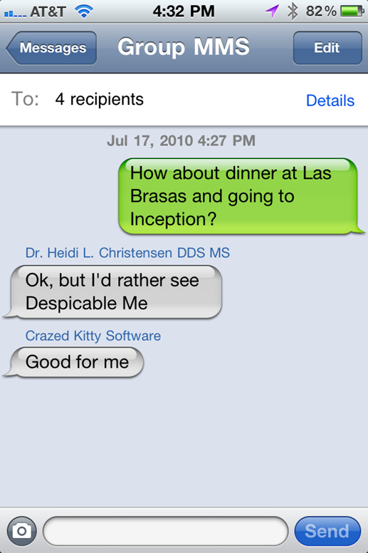
I'm asserting that a decision was made that SMS messages were green.
Then a decision was made that iMessage messages would be blue.
I'm asserting this was not done with animosity. It was a decision by Apple's UX team to make it easy to visually identify the difference between the message mechanics and capabilities of the end-user.
It is remarkably simple, effective and easily understood.
If Apple chose to make it so there was no visual distinction between the message sending mechanisms, that would be a worse, and more confusing, user experience.
If Apple changed the colors, whatever the new colors they chose to use would just be the new focus of the debate. It would become "Orange Bubbles vs Blue Bubbles" or "Purple Bubbles vs Blue Bubbles". People would argue that Apple chose the new color based on some secondary negative characteristic of the new color, just as they do today with green.
I'm not asserting that Apple's choice of color is malicious; just that it needs to be improved.
Also, I'm not asserting that Green is bad. The issue is the shade of Green, and the a11y issues it creates. I don't know how you jumped on "entirely different colors" or "the same color"; Android's criticism in the original article is very clear, its an a11y contrast issue with the light green background and white text. That's it. Nothing else.
This issue is, seriously, a lot simpler than you're exploding it to be. Make it 10 shades darker; done. They even have an option in their accessibility settings to make it so. This is a simple change, any a11y expert (including, maybe, the MANY apple themselves employs) would say the way it stands today is bad, but their inaction conveys intention.
Apple has had an "increase contrast" option on iOS, which does exactly what you're asking for, specifically designed for a11y, within the Accessibility Settings panel of iOS, since iOS 8 I believe, potentially earlier. This increases contrasts throughout the entire iOS experience, and yes, makes the green bubbles several shades darker.
They are not "inactive".
(It's also important to remember that the "green bubbles" applies to messages sent, not received. Received texts, no matter to mechanism, are either black text on grey, or white text on near-black depending on Dark mode)
Now compare it to green bubbles today. Anyways, when I had iPhone, flat green bubbles annoyed me. Not because "hurr-durr I have a iPhone and you don't" but because SMS lacked many features and was hella slow to send. Plus, pretty much anywhere I lived I had horrible cellphone reception which made sending SMS a nightmare.
Then a decision was made that iMessage messages would be blue.
I'm asserting this was not done with animosity. It was a decision by Apple's UX team to make it easy to visually identify the difference between the message mechanics and capabilities of the end-user.
It is remarkably simple, effective and easily understood.
If Apple chose to make it so there was no visual distinction between the message sending mechanisms, that would be a worse, and more confusing, user experience.
If Apple changed the colors, whatever the new colors they chose to use would just be the new focus of the debate. It would become "Orange Bubbles vs Blue Bubbles" or "Purple Bubbles vs Blue Bubbles". People would argue that Apple chose the new color based on some secondary negative characteristic of the new color, just as they do today with green.